[HarmonyOS NEXT 实战案例:健康应用] 高级篇 - 健康数据仪表盘的高级布局与自适应设计
项目已开源,开源地址: https://gitcode.com/nutpi/HarmonyosNextCaseStudyTutorial , 欢迎fork & star效果演示
引言
在前两篇教程中,我们学习了如何使用HarmonyOS NEXT的RowSplit组件构建健康数据仪表盘的基本布局,以及如何添加交互功能和状态管理。本篇教程将进一步深入,讲解健康数据仪表盘的高级布局技巧和自适应设计,使应用能够在不同尺寸的设备上提供一致且优质的用户体验。
自适应布局概述
自适应布局是指应用界面能够根据设备屏幕尺寸和方向自动调整布局,提供最佳的用户体验。在HarmonyOS NEXT中,我们可以使用以下技术实现自适应布局:
技术描述使用场景媒体查询根据设备屏幕尺寸和方向应用不同的样式在不同尺寸的设备上使用不同的布局百分比布局使用百分比值设置组件尺寸使组件尺寸相对于父容器自动调整弹性布局使用弹性布局使组件自动填充可用空间使组件尺寸相对于可用空间自动调整栅格布局使用栅格系统组织界面元素创建复杂且响应式的布局高级布局技巧
1. 使用媒体查询实现响应式布局媒体查询允许我们根据设备屏幕尺寸和方向应用不同的样式。在HarmonyOS NEXT中,我们可以使用@MediaQuery装饰器实现媒体查询:
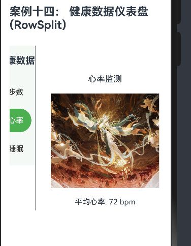
@Component export struct HealthDashboard { @State currentTab: string = 'steps' @State datalist: DataItem[] = [...] @State Status: StatusItem[] = [...] // 添加媒体查询状态 @State isWideScreen: boolean = false @State navWidth: string = '25%' @State contentPadding: number = 20 // 媒体查询装饰器 @MediaQuery(MediaQueryCondition.WIDE_SCREEN) onWideScreen(matches: boolean) { this.isWideScreen = matches this.navWidth = matches ? '20%' : '25%' this.contentPadding = matches ? 30 : 20 } build() { // 根据屏幕宽度选择不同的布局 if (this.isWideScreen) { this.buildWideScreenLayout() } else { this.buildNormalLayout() } } // 宽屏布局 buildWideScreenLayout() { RowSplit() { // 左侧导航 Column() { Text('健康数据') .fontSize(24) // 增大字体 .fontWeight(FontWeight.Bold) .margin({ top: 30, bottom: 40 }) // 增大边距 ForEach(this.datalist, (item: DataItem) => { Button(item.name) .width('80%') .height(60) // 增大按钮高度 .fontSize(18) // 增大字体 .backgroundColor(this.currentTab === item.id ? '#4CAF50' : 'transparent') .fontColor(this.currentTab === item.id ? '#ffffff' : '#333333') .onClick(() => { this.currentTab = item.id }) .margin({ bottom: 15 }) // 增大边距 }) } .width(this.navWidth) .backgroundColor('#f5f9f5') // 主内容区 Column() { // 根据当前标签页显示不同内容 if (this.currentTab === 'steps') { this.buildStepsContent() } else if (this.currentTab === 'heart') { this.buildHeartContent() } else { this.buildSleepContent() } } .padding(this.contentPadding) } .height(500) // 增大高度 } // 普通布局 buildNormalLayout() { RowSplit() { // 左侧导航 Column() { Text('健康数据') .fontSize(20) .fontWeight(FontWeight.Bold) .margin({ top: 20, bottom: 30 }) ForEach(this.datalist, (item: DataItem) => { Button(item.name) .width('80%') .height(50) .fontSize(16) .backgroundColor(this.currentTab === item.id ? '#4CAF50' : 'transparent') .fontColor(this.currentTab === item.id ? '#ffffff' : '#333333') .onClick(() => { this.currentTab = item.id }) .margin({ bottom: 10 }) }) } .width(this.navWidth) .backgroundColor('#f5f9f5') // 主内容区 Column() { // 根据当前标签页显示不同内容 if (this.currentTab === 'steps') { this.buildStepsContent() } else if (this.currentTab === 'heart') { this.buildHeartContent() } else { this.buildSleepContent() } } .padding(this.contentPadding) } .height(400) } // 步数内容构建方法 buildStepsContent() { Column() { Text('今日步数') .fontSize(this.isWideScreen ? 22 : 18) .margin({ bottom: this.isWideScreen ? 30 : 20 }) Progress({ value: 7500, total: 10000, type: ProgressType.Linear }) .width('90%') .height(this.isWideScreen ? 25 : 20) Text('7500/10000 步') .fontSize(this.isWideScreen ? 18 : 16) .margin({ top: this.isWideScreen ? 15 : 10 }) } .height('100%') .justifyContent(FlexAlign.Center) } // 心率内容构建方法 buildHeartContent() { Column() { Text('心率监测') .fontSize(this.isWideScreen ? 22 : 18) .margin({ bottom: this.isWideScreen ? 30 : 20 }) Image($r('app.media.big20')) .width('90%') .height(this.isWideScreen ? 250 : 200) Text('平均心率: 72 bpm') .fontSize(this.isWideScreen ? 18 : 16) .margin({ top: this.isWideScreen ? 25 : 20 }) } .height('100%') .justifyContent(FlexAlign.Center) } // 睡眠内容构建方法 buildSleepContent() { Column() { Text('睡眠分析') .fontSize(this.isWideScreen ? 22 : 18) .margin({ bottom: this.isWideScreen ? 30 : 20 }) // 在宽屏模式下使用水平布局,在普通模式下使用垂直布局 if (this.isWideScreen) { Row() { // 睡眠状态图表 this.buildSleepChart() // 睡眠状态图例 this.buildSleepLegend() } .width('100%') .justifyContent(FlexAlign.SpaceBetween) } else { Column() { // 睡眠状态图表 this.buildSleepChart() // 睡眠状态图例 this.buildSleepLegend() .margin({ top: 20 }) } .width('100%') } } .height('100%') .justifyContent(FlexAlign.Center) } // 睡眠图表构建方法 @Builder buildSleepChart() { Stack() { // 使用饼图展示睡眠状态 Row() { ForEach(this.Status, (item: StatusItem) => { Column() { Stack() { Circle() .width(this.isWideScreen ? 150 : 120) .height(this.isWideScreen ? 150 : 120) .fill('#f0f0f0') Arc() .width(this.isWideScreen ? 150 : 120) .height(this.isWideScreen ? 150 : 120) .startAngle(0) .sweepAngle(item.value * 3.6) // 将百分比转换为角度 .stroke(item.color) .strokeWidth(this.isWideScreen ? 20 : 15) } } }) } } .width(this.isWideScreen ? '50%' : '100%') } // 睡眠图例构建方法 @Builder buildSleepLegend() { Column() { ForEach(this.Status, (item: StatusItem) => { Row() { Circle() .width(this.isWideScreen ? 20 : 15) .height(this.isWideScreen ? 20 : 15) .fill(item.color) .margin({ right: this.isWideScreen ? 15 : 10 }) Text(`${item.label}: ${item.value}%`) .fontSize(this.isWideScreen ? 16 : 14) } .margin({ bottom: this.isWideScreen ? 10 : 5 }) }) } .width(this.isWideScreen ? '40%' : '100%') } }2. 使用栅格布局组织复杂界面
栅格布局是一种将界面划分为网格的布局方式,可以帮助我们创建复杂且响应式的布局。在HarmonyOS NEXT中,我们可以使用GridRow和GridCol组件实现栅格布局:
@Component struct GridLayoutExample { build() { Column() { GridRow() { GridCol({ span: 12 }) { Text('健康数据仪表盘') .fontSize(24) .fontWeight(FontWeight.Bold) .width('100%') .textAlign(TextAlign.Center) .margin({ bottom: 20 }) } GridCol({ span: 4 }) { this.buildNavigation() } GridCol({ span: 8 }) { this.buildContent() } } .gutter(16) // 设置列间距 } .width('100%') .padding(20) } @Builder buildNavigation() { // 导航内容 } @Builder buildContent() { // 主内容 } }3. 使用@BuilderParam实现布局定制
@BuilderParam装饰器允许我们将UI构建逻辑作为参数传递给组件,从而实现高度定制化的布局:
@Component struct DashboardCard { @Prop title: string @BuilderParam content: () => void @BuilderParam header?: () => void @BuilderParam footer?: () => void build() { Column() { // 卡片头部(可选) if (this.header) { this.header() } else { Text(this.title) .fontSize(18) .fontWeight(FontWeight.Bold) .margin({ bottom: 16 }) } // 卡片内容 this.content() // 卡片底部(可选) if (this.footer) { this.footer() } } .width('100%') .padding(16) .backgroundColor('#ffffff') .borderRadius(8) .shadow({ radius: 4, color: '#0000001A', offsetX: 0, offsetY: 2 }) } }
使用这个组件可以创建高度定制化的仪表盘卡片:
DashboardCard({ title: '今日步数', header: () => { Row() { Text('今日步数') .fontSize(18) .fontWeight(FontWeight.Bold) Blank() Button('查看详情') .fontSize(14) .height(32) .backgroundColor('#4CAF50') } .width('100%') .margin({ bottom: 16 }) }, content: () => { Column() { Progress({ value: 7500, total: 10000, type: ProgressType.Linear }) .width('100%') .height(20) Text('7500/10000 步') .fontSize(16) .margin({ top: 10 }) } }, footer: () => { Text('目标完成率: 75%') .fontSize(14) .fontColor('#666666') .margin({ top: 16 }) } })
高级组件封装
1. 数据仪表盘组件我们可以创建一个通用的数据仪表盘组件,用于展示各种类型的健康数据:
@Component struct DataDashboard { @Prop title: string @Prop value: number @Prop unit: string @Prop maxValue: number @Prop color: string = '#4CAF50' @Prop type: string = 'circle' // 'circle' | 'linear' | 'arc' build() { Column() { Text(this.title) .fontSize(16) .fontWeight(FontWeight.Medium) .margin({ bottom: 16 }) if (this.type === 'circle') { this.buildCircleProgress() } else if (this.type === 'linear') { this.buildLinearProgress() } else { this.buildArcProgress() } Text(`${this.value} ${this.unit}`) .fontSize(18) .fontWeight(FontWeight.Bold) .margin({ top: 16 }) } .width('100%') .padding(16) .backgroundColor('#ffffff') .borderRadius(8) .shadow({ radius: 4, color: '#0000001A', offsetX: 0, offsetY: 2 }) } @Builder buildCircleProgress() { Stack() { Circle() .width(120) .height(120) .fill('#f0f0f0') Progress({ value: this.value, total: this.maxValue, type: ProgressType.Ring }) .width(120) .height(120) .color(this.color) } } @Builder buildLinearProgress() { Progress({ value: this.value, total: this.maxValue, type: ProgressType.Linear }) .width('100%') .height(20) .color(this.color) } @Builder buildArcProgress() { Stack() { Arc() .width(120) .height(120) .startAngle(180) .sweepAngle(180) .stroke('#f0f0f0') .strokeWidth(10) Arc() .width(120) .height(120) .startAngle(180) .sweepAngle(180 * this.value / this.maxValue) .stroke(this.color) .strokeWidth(10) } } }
使用这个组件可以创建各种类型的数据仪表盘:
Row() { DataDashboard({ title: '今日步数', value: 7500, unit: '步', maxValue: 10000, color: '#4CAF50', type: 'linear' }) .layoutWeight(1) .margin({ right: 8 }) DataDashboard({ title: '平均心率', value: 72, unit: 'bpm', maxValue: 100, color: '#F44336', type: 'circle' }) .layoutWeight(1) .margin({ left: 8 }) } .width('100%') .margin({ bottom: 16 }) Row() { DataDashboard({ title: '睡眠时长', value: 7.5, unit: '小时', maxValue: 10, color: '#2196F3', type: 'arc' }) .layoutWeight(1) .margin({ right: 8 }) DataDashboard({ title: '卡路里', value: 350, unit: 'kcal', maxValue: 500, color: '#FF9800', type: 'circle' }) .layoutWeight(1) .margin({ left: 8 }) } .width('100%')2. 图表组件
我们可以创建一个通用的图表组件,用于展示各种类型的健康数据趋势:
@Component struct ChartComponent { @Prop title: string @Prop data: Array<{ label: string, value: number }> @Prop color: string = '#4CAF50' @Prop type: string = 'bar' // 'bar' | 'line' | 'pie' @State private maxValue: number = 0 @State private chartWidth: number = 0 @State private chartHeight: number = 200 aboutToAppear() { // 计算最大值 this.maxValue = Math.max(...this.data.map(item => item.value)) } build() { Column() { Text(this.title) .fontSize(16) .fontWeight(FontWeight.Medium) .margin({ bottom: 16 }) if (this.type === 'bar') { this.buildBarChart() } else if (this.type === 'line') { this.buildLineChart() } else { this.buildPieChart() } } .width('100%') .padding(16) .backgroundColor('#ffffff') .borderRadius(8) .shadow({ radius: 4, color: '#0000001A', offsetX: 0, offsetY: 2 }) .onAreaChange((oldArea: Area, newArea: Area) => { this.chartWidth = newArea.width as number - 32 // 减去内边距 }) } @Builder buildBarChart() { Column() { // Y轴最大值 Text(`${this.maxValue}`) .fontSize(12) .fontColor('#666666') .textAlign(TextAlign.End) .width('100%') // 图表区域 Row() { ForEach(this.data, (item, index) => { Column() { // 柱形 Stack() { Rectangle() .width(20) .height(this.chartHeight) .fill('#f0f0f0') Rectangle() .width(20) .height(this.chartHeight * item.value / this.maxValue) .fill(this.color) .alignSelf(ItemAlign.End) } .height(this.chartHeight) // 标签 Text(item.label) .fontSize(12) .fontColor('#666666') .margin({ top: 8 }) } .margin({ right: index < this.data.length - 1 ? (this.chartWidth - 20 * this.data.length) / (this.data.length - 1) : 0 }) }) } .width('100%') .justifyContent(FlexAlign.SpaceBetween) // X轴 Divider() .width('100%') .color('#f0f0f0') .margin({ top: 8 }) } } @Builder buildLineChart() { // 线形图实现 // 由于HarmonyOS NEXT目前没有直接的线形图组件,这里可以使用Path组件绘制折线 // 或者使用第三方图表库 } @Builder buildPieChart() { // 饼图实现 // 可以使用多个Arc组件组合实现饼图 // 或者使用第三方图表库 } }
使用这个组件可以创建各种类型的图表:
ChartComponent({ title: '一周步数趋势', data: [ { label: '周一', value: 8000 }, { label: '周二', value: 7500 }, { label: '周三', value: 9000 }, { label: '周四', value: 8500 }, { label: '周五', value: 7000 }, { label: '周六', value: 6500 }, { label: '周日', value: 8000 } ], color: '#4CAF50', type: 'bar' }) .margin({ bottom: 16 })
主题切换
我们可以实现主题切换功能,允许用户在浅色主题和深色主题之间切换:
@Component export struct HealthDashboard { @State currentTab: string = 'steps' @State datalist: DataItem[] = [...] @State Status: StatusItem[] = [...] // 添加主题状态 @State isDarkMode: boolean = false @State themeColors: { [key: string]: string } = { // 浅色主题颜色 light: { background: '#ffffff', navBackground: '#f5f9f5', text: '#333333', secondaryText: '#666666', primary: '#4CAF50', secondary: '#8BC34A', tertiary: '#CDDC39', cardBackground: '#ffffff', divider: '#f0f0f0' }, // 深色主题颜色 dark: { background: '#121212', navBackground: '#1e1e1e', text: '#ffffff', secondaryText: '#aaaaaa', primary: '#81C784', secondary: '#AED581', tertiary: '#DCE775', cardBackground: '#1e1e1e', divider: '#333333' } } // 获取当前主题颜色 get colors() { return this.isDarkMode ? this.themeColors.dark : this.themeColors.light } build() { Column() { // 主题切换按钮 Row() { Text('主题模式') .fontSize(16) .fontColor(this.colors.text) Blank() Toggle({ type: ToggleType.Switch, isOn: this.isDarkMode }) .onChange((isOn: boolean) => { this.isDarkMode = isOn }) } .width('100%') .padding(16) // 健康数据仪表盘 RowSplit() { // 左侧导航 Column() { Text('健康数据') .fontSize(20) .fontWeight(FontWeight.Bold) .fontColor(this.colors.text) .margin({ top: 20, bottom: 30 }) ForEach(this.datalist, (item: DataItem) => { Button(item.name) .width('80%') .height(50) .fontSize(16) .backgroundColor(this.currentTab === item.id ? this.colors.primary : 'transparent') .fontColor(this.currentTab === item.id ? '#ffffff' : this.colors.text) .onClick(() => { this.currentTab = item.id }) .margin({ bottom: 10 }) }) } .width('25%') .backgroundColor(this.colors.navBackground) // 主内容区 Column() { // 根据当前标签页显示不同内容 if (this.currentTab === 'steps') { this.buildStepsContent() } else if (this.currentTab === 'heart') { this.buildHeartContent() } else { this.buildSleepContent() } } .padding(20) .backgroundColor(this.colors.background) } .height(400) } .width('100%') .backgroundColor(this.colors.background) } // 步数内容构建方法 buildStepsContent() { Column() { Text('今日步数') .fontSize(18) .fontColor(this.colors.text) .margin({ bottom: 20 }) Progress({ value: 7500, total: 10000, type: ProgressType.Linear }) .width('90%') .height(20) .color(this.colors.primary) Text('7500/10000 步') .fontSize(16) .fontColor(this.colors.text) .margin({ top: 10 }) } .height('100%') .justifyContent(FlexAlign.Center) } // 心率内容构建方法 buildHeartContent() { // 类似地,更新心率内容的颜色 } // 睡眠内容构建方法 buildSleepContent() { Column() { Text('睡眠分析') .fontSize(18) .fontColor(this.colors.text) .margin({ bottom: 20 }) Stack() { ForEach(this.Status, (item: StatusItem, index) => { Row() { Circle() .width(15) .height(15) .fill(index === 0 ? this.colors.primary : (index === 1 ? this.colors.secondary : this.colors.tertiary)) .margin({ right: 10 }) Text(`${item.label}: ${item.value}%`) .fontSize(14) .fontColor(this.colors.text) } .margin({ bottom: 5 }) }) } } .height('100%') .justifyContent(FlexAlign.Center) } }
多语言支持
我们可以实现多语言支持,允许应用在不同语言环境下显示不同的文本:
@Component export struct HealthDashboard { @State currentTab: string = 'steps' @State datalist: DataItem[] = [...] @State Status: StatusItem[] = [...] // 添加语言状态 @State currentLanguage: string = 'zh' @State translations: { [key: string]: { [key: string]: string } } = { // 中文翻译 zh: { title: '健康数据', steps: '步数', heart: '心率', sleep: '睡眠', todaySteps: '今日步数', stepsUnit: '步', heartRate: '心率监测', averageHeartRate: '平均心率', bpm: 'bpm', sleepAnalysis: '睡眠分析', deepSleep: '深睡', lightSleep: '浅睡', awake: '清醒' }, // 英文翻译 en: { title: 'Health Data', steps: 'Steps', heart: 'Heart Rate', sleep: 'Sleep', todaySteps: 'Today's Steps', stepsUnit: 'steps', heartRate: 'Heart Rate Monitor', averageHeartRate: 'Average Heart Rate', bpm: 'bpm', sleepAnalysis: 'Sleep Analysis', deepSleep: 'Deep Sleep', lightSleep: 'Light Sleep', awake: 'Awake' } } // 获取当前语言的翻译 get t() { return this.translations[this.currentLanguage] } // 初始化数据 aboutToAppear() { this.updateDatalist() this.updateStatus() } // 更新导航菜单数据 updateDatalist() { this.datalist = [ { icon: $r('app.media.01'), name: this.t.steps, id: 'steps' }, { icon: $r('app.media.02'), name: this.t.heart, id: 'heart' }, { icon: $r('app.media.03'), name: this.t.sleep, id: 'sleep' } ] } // 更新睡眠状态数据 updateStatus() { this.Status = [ { value: 30, color: '#4CAF50', label: this.t.deepSleep }, { value: 50, color: '#8BC34A', label: this.t.lightSleep }, { value: 20, color: '#CDDC39', label: this.t.awake } ] } build() { Column() { // 语言切换按钮 Row() { Text('Language / 语言') .fontSize(16) Blank() Button(this.currentLanguage === 'zh' ? 'English' : '中文') .onClick(() => { this.currentLanguage = this.currentLanguage === 'zh' ? 'en' : 'zh' this.updateDatalist() this.updateStatus() }) } .width('100%') .padding(16) // 健康数据仪表盘 RowSplit() { // 左侧导航 Column() { Text(this.t.title) .fontSize(20) .fontWeight(FontWeight.Bold) .margin({ top: 20, bottom: 30 }) ForEach(this.datalist, (item: DataItem) => { Button(item.name) .width('80%') .height(50) .fontSize(16) .backgroundColor(this.currentTab === item.id ? '#4CAF50' : 'transparent') .fontColor(this.currentTab === item.id ? '#ffffff' : '#333333') .onClick(() => { this.currentTab = item.id }) .margin({ bottom: 10 }) }) } .width('25%') .backgroundColor('#f5f9f5') // 主内容区 Column() { // 根据当前标签页显示不同内容 if (this.currentTab === 'steps') { this.buildStepsContent() } else if (this.currentTab === 'heart') { this.buildHeartContent() } else { this.buildSleepContent() } } .padding(20) } .height(400) } .width('100%') } // 步数内容构建方法 buildStepsContent() { Column() { Text(this.t.todaySteps) .fontSize(18) .margin({ bottom: 20 }) Progress({ value: 7500, total: 10000, type: ProgressType.Linear }) .width('90%') .height(20) Text(`7500/10000 ${this.t.stepsUnit}`) .fontSize(16) .margin({ top: 10 }) } .height('100%') .justifyContent(FlexAlign.Center) } // 心率内容构建方法 buildHeartContent() { Column() { Text(this.t.heartRate) .fontSize(18) .margin({ bottom: 20 }) Image($r('app.media.big20')) .width('90%') .height(200) Text(`${this.t.averageHeartRate}: 72 ${this.t.bpm}`) .fontSize(16) .margin({ top: 20 }) } .height('100%') .justifyContent(FlexAlign.Center) } // 睡眠内容构建方法 buildSleepContent() { Column() { Text(this.t.sleepAnalysis) .fontSize(18) .margin({ bottom: 20 }) Stack() { ForEach(this.Status, (item: StatusItem) => { Row() { Circle() .width(15) .height(15) .fill(item.color) .margin({ right: 10 }) Text(`${item.label}: ${item.value}%`) .fontSize(14) } .margin({ bottom: 5 }) }) } } .height('100%') .justifyContent(FlexAlign.Center) } }
总结
在本教程中,我们学习了健康数据仪表盘的高级布局技巧和自适应设计,但案例仍有完善空间